CLIENT
Booking.com
ROLE
Design director
AGENCY
AnalogFolk
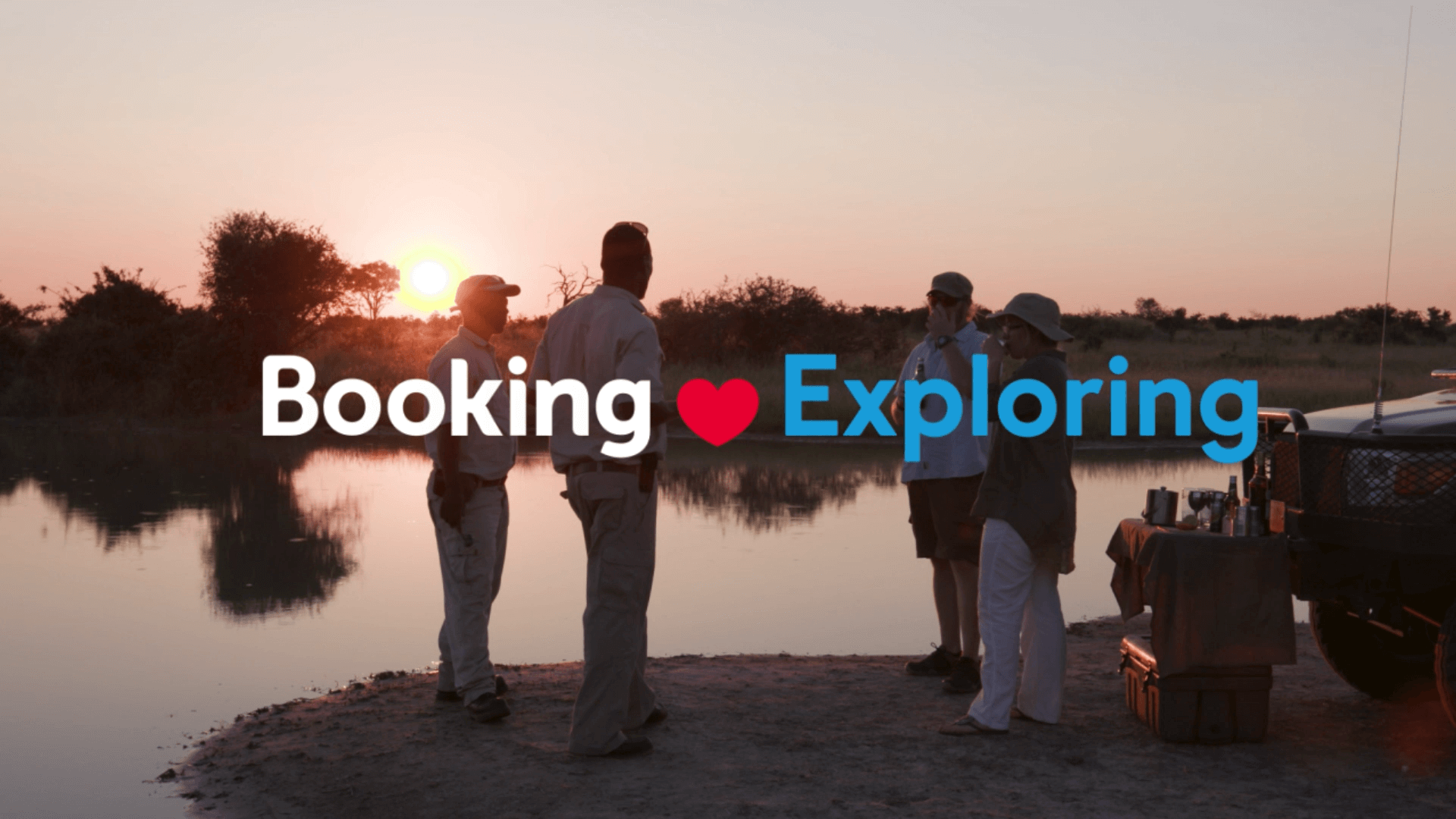
Booking Loves
Unlocking brand relevance with data-powered storytelling
Few companies are powered by data like Booking.com. As a digital company, driven by constantly testing and optimising its platform, it was making surprisingly little use of other digital channels to drive traffic. In fact, most of its advertising muscle was still TV-based.
Its ATL ads sold the ‘click to book’ moment. Except, there was a lot of competition for that moment, even from Google itself. That’s awkward given that Booking.com was spending $1 billion per quarter with Google on search advertising. The brand needed help to stand out in a sea of functional choices and make it about more than just booking.
Booking.com is driven by data, and so was our campaign platform. Booking Loves uncovered and retold the human stories in Booking.com data, transforming the brand from a booking engine to a consideration engine.
From football to food, shopping to beaches, Booking.com data told us all the passionate reasons people travel, and these passions were the compelling launch pad for multiple interest-led campaigns, especially when combined with seasonal insights and our wide knowledge of travel industry trends.
Role
As design director for the Booking.com account, I was the brand guardian and responsible for the standard of design output for the agency. My role was to lead other designers in the team as well creating hands-on work.
The client wanted to test and learn using social media campaigns so we explored different visual approaches. Varying levels of budget and production were implemented and the engagement data informed further iterations and media.
Booking Hero
Think back to your most unforgettable travel memories. Remember the hotel employee that helped you organise a last-minute proposal on the beach so that you could pop the question in paradise? What about the apartment owner that drove you to the airport herself when your taxi didn’t show up so that you didn’t miss your flight? What do these special moments have in common? Someone went out of their way to make or save your trip and Booking.com wanted to hear all about it.
We invited customers to tell the world their story of an accommodation provider that made their trip unforgettable. The Booking Heroes competition championed the outstanding hospitality of accommodation providers that offered their guests far more than a place to rest their head. By sharing their stories, customers could earn a chance to win €25,000 of Booking.com travel credit – both for them, and their Booking Hero.
Close to home
To experience breathtaking scenery, incredible new cuisine or new ways of life, people often think they have to travel a long way from home.
We had some fun challenging this common misconception by presenting destinations that are closer to home. This expanded holiday considerations that are epic and aspirational to be local and achievable.
After increased social media campaign engagement in the UK, similar travel insights were successfully tested in the Brazilian market.
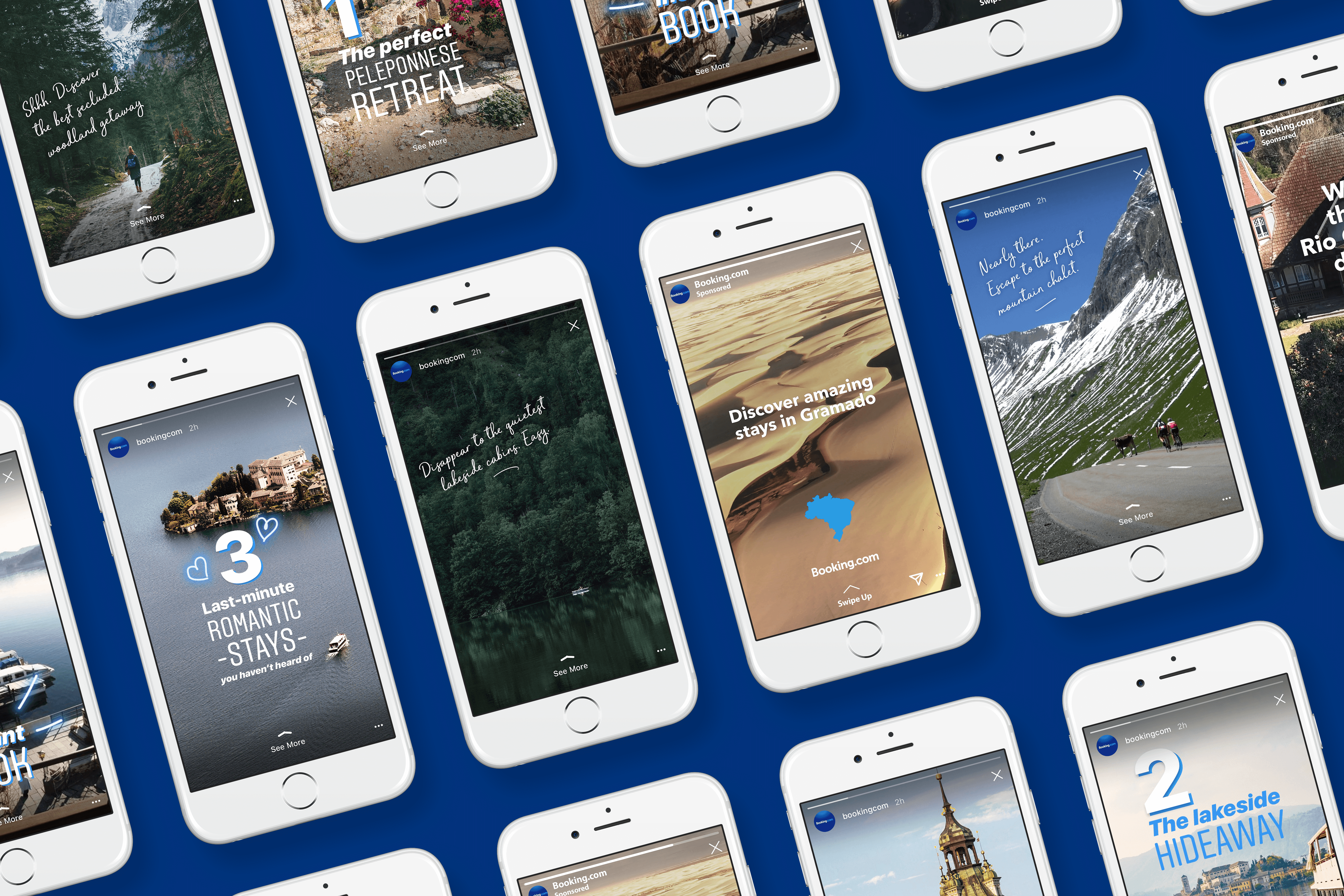
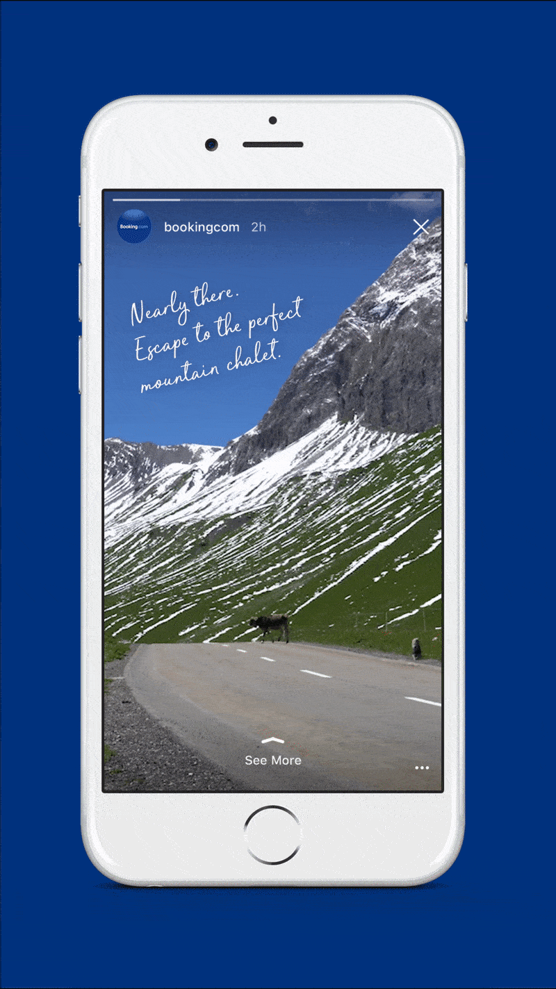
Mindful Moments
Often people are seeking a mindful, calm break from the chaos of working life – a secluded getaway.
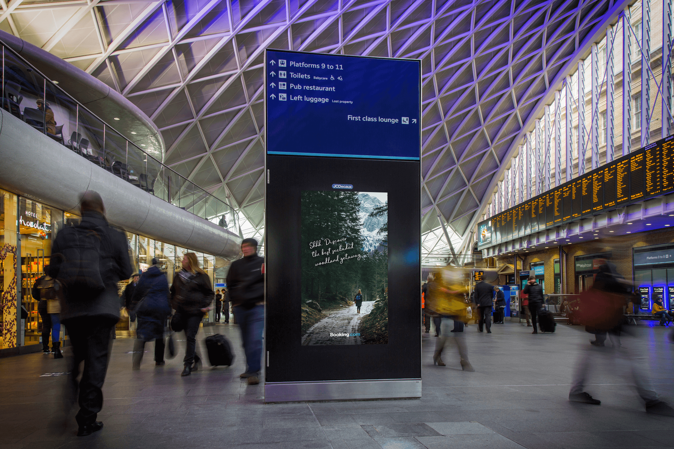
By highlighting some of Booking.com’s more remote destinations we could appeal to that desire for escape. Most Instagram stories are bold and loud to grab attention. We decided to disrupt the doom-scrolling and create a series of calm, near-silent stories. Each one captures a beautiful, natural moment you can imagine yourself in, with subtle branding and a nudge to the destination.
The same approach was used in busy transport hubs, juxtaposing the chaos of city commuting with the serenity of a mountain lake-side cabin.
Booking Loved
This approach turned the brand’s Instagram account from a complaints hub to a positive space to rival that of a premium publisher. Using data, not only did we manage to connect directly with the passionate reasons people travel, but we helped Booking.com's advertising to be more dynamic and efficient.
Through testing and learning by design, campaigns could adapt quickly. And it helped this travel booking brand be part of travel dreaming and travel planning moments, too.
RESULTS
320%
Increase in Instagram followers during the first year
12%
Increase in site traffic and 27% view through rate (VTR)
50%
Reduction in cost-per-click (CPC)