CLIENT
Sainsbury's
ROLE
Head of design
AGENCY
AllofUs
YEAR
2016
Sainsbury's visual language
The beautiful everyday
PART 1 of 2 – SAINSBURY'S DIGITAL EXPERIENCE FRAMEWORK*
Sainsbury’s needed to unify their digital design approach to create a consistent brand experience for customers across multiple touchpoints. The business identified that a Digital Experience Framework was required. To achieve this a fresh, consolidated visual direction and a structured design system would need to be developed to support all future work.
*NOTE
This project is split into two case studies:
Sainsbury’s visual language – The project page you’re currently on outlines the discovery phase, design process, and visual design exploration.
LUNA Design System – the design system framework and guidelines that formed the foundation of Sainsbury’s design programme that continues today. This can be viewed as a separate project presentation.
Project background
The Sainsbury’s digital design landscape was extremely fragmented – inconsistencies between online products and services undermined the trusted grocery brand.
AllofUs was brought into the Sainsbury’s Digital Experience (DX) team as a consultancy to help with their ambition to create a Digital Experience Framework. As a relatively new department, they had strong UX, research, and copy teams but needed an agency partner to provide creative leadership and visual design direction. Creating consistency across touchpoints would improve customer experience and strengthen brand identity.
During our partnership, we were to develop and cultivate a richer understanding of the visual design process within the Sainsbury’s team.
The project was divided into three distinct stages:
The first two phases set out to establish a visual language and are demonstrated in this project case study. The Discovery phase involved analysis, exploration, setting design principles, and art direction. During the Concept phase, we applied this in detail to real products across different channels – essentially bringing the design to life.
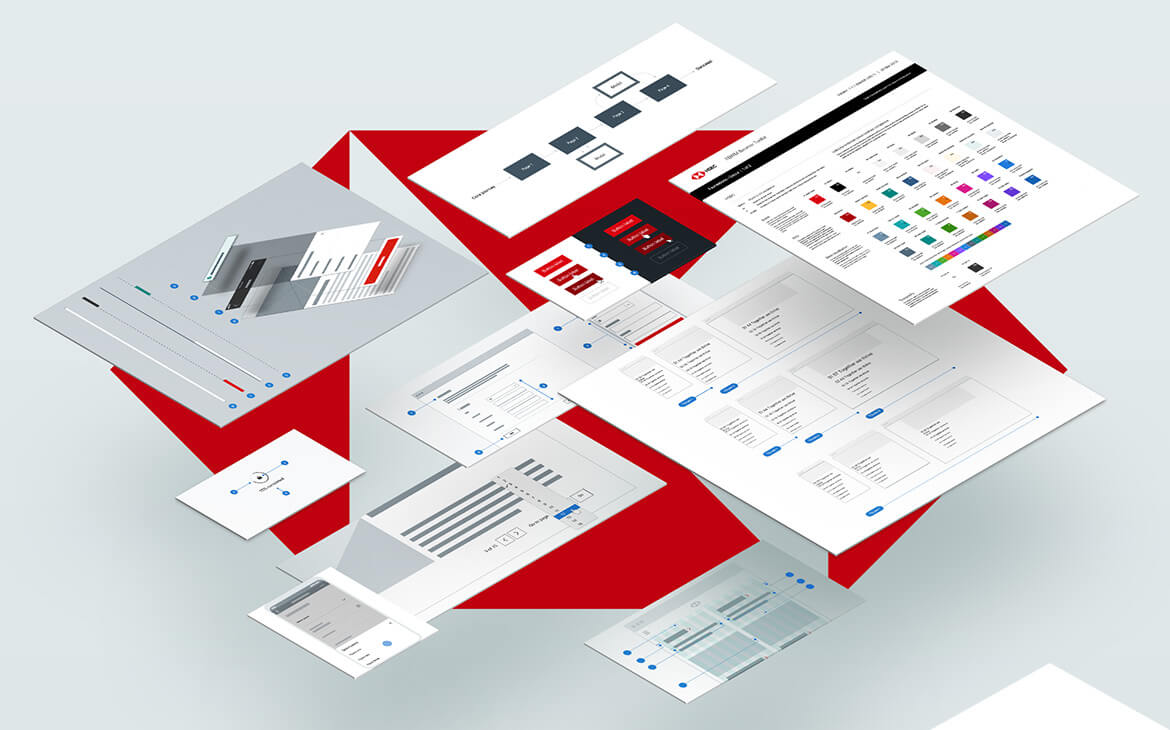
The Guidelines phase encompassed distilling everything we had created into concise design system guidelines to provide the framework for all future Sainsbury’s digital work.
Along the course of our engagement with Sainsbury's, this evolved to become known as project LUNA and is what the system is still called today. The LUNA design system guidelines can be viewed as a separate case study.
Working with UX
The Sainsbury’s User Experience team had significant data, research and insights to help our team with productive collaboration. Their ambition to create the best customer-centric shopping experience was a reassuring compliment to our design system aspiration.
Sainsbury’s already owned other offerings beyond groceries, including Sainsbury’s Bank and Tu clothing but the business sought expansion into even more diverse products. The design experience had to be flexible enough to work across multiple channels.
The strategy was to focus on the customer experience across groceries and fashion for responsive web and native apps. This would allow us to stress-test our design system for different product categories and aesthetics while ensuring a sustainable and consistent user experience.
Art direction and design principles
Overview
To establish a visual language, it’s important to begin with what you already have. The team scrutinised Sainsbury’s existing digital landscape and sought inspiration from the brand’s design - past and present.
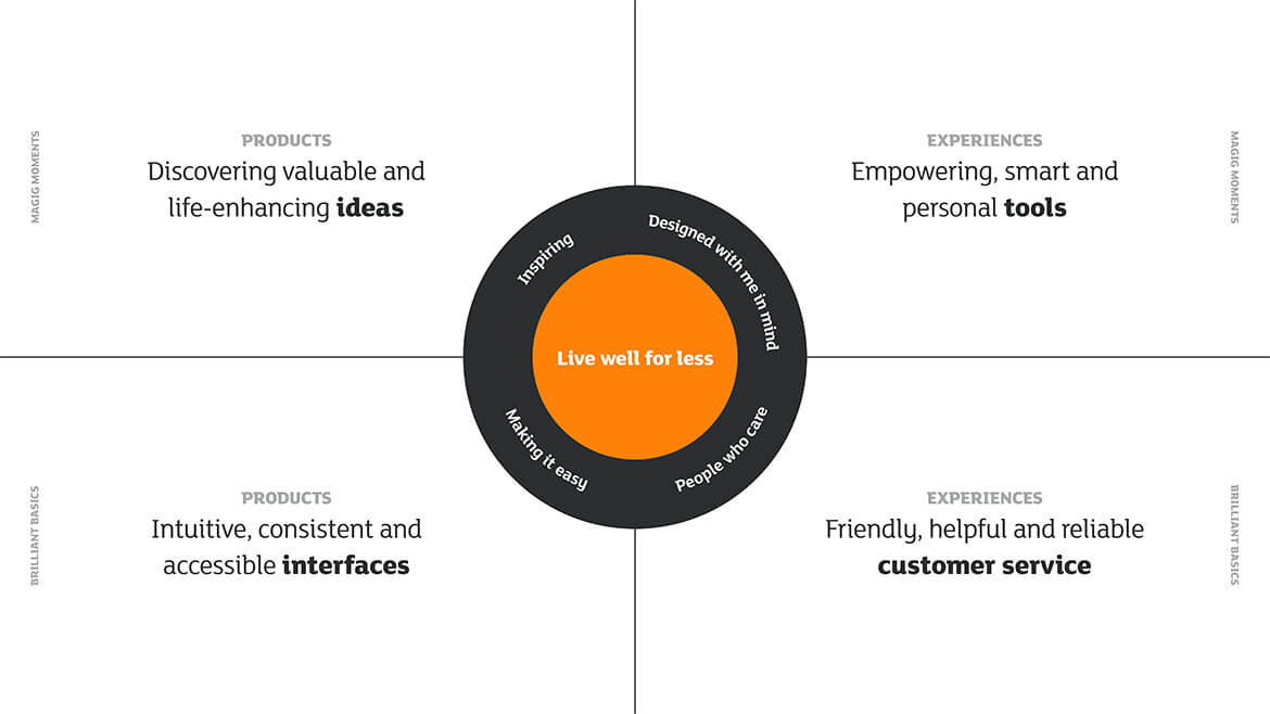
Taking Sainsbury’s core value of “Live Well For Less” gave birth to principles that would be the foundation of the UI and UX design approach.
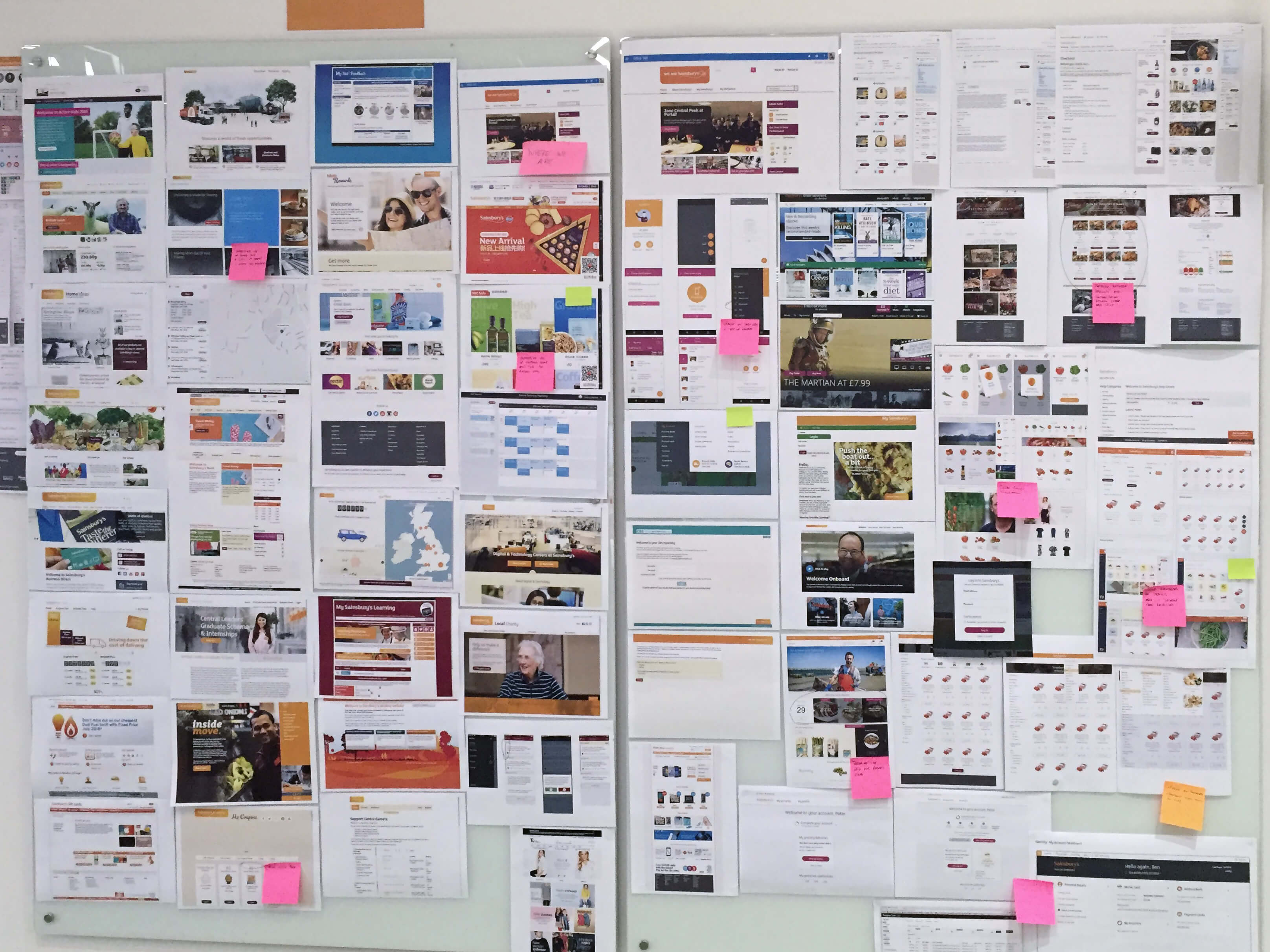
Existing landscape
After performing an extensive design audit it was apparent that Sainsbury’s digital landscape had no cohesive experience design nor visual uniformity. We discovered points that needed to be addressed:
- A lack of consistency across all touchpoints
- No clear, strong identity within and across products
- Interaction and motion were not part of existing design thinking
Brand inspiration
Our design team trawled through Sainsbury’s rich history of visual design for inspiration, including examples of great digital design projects of recent times.

Design principles
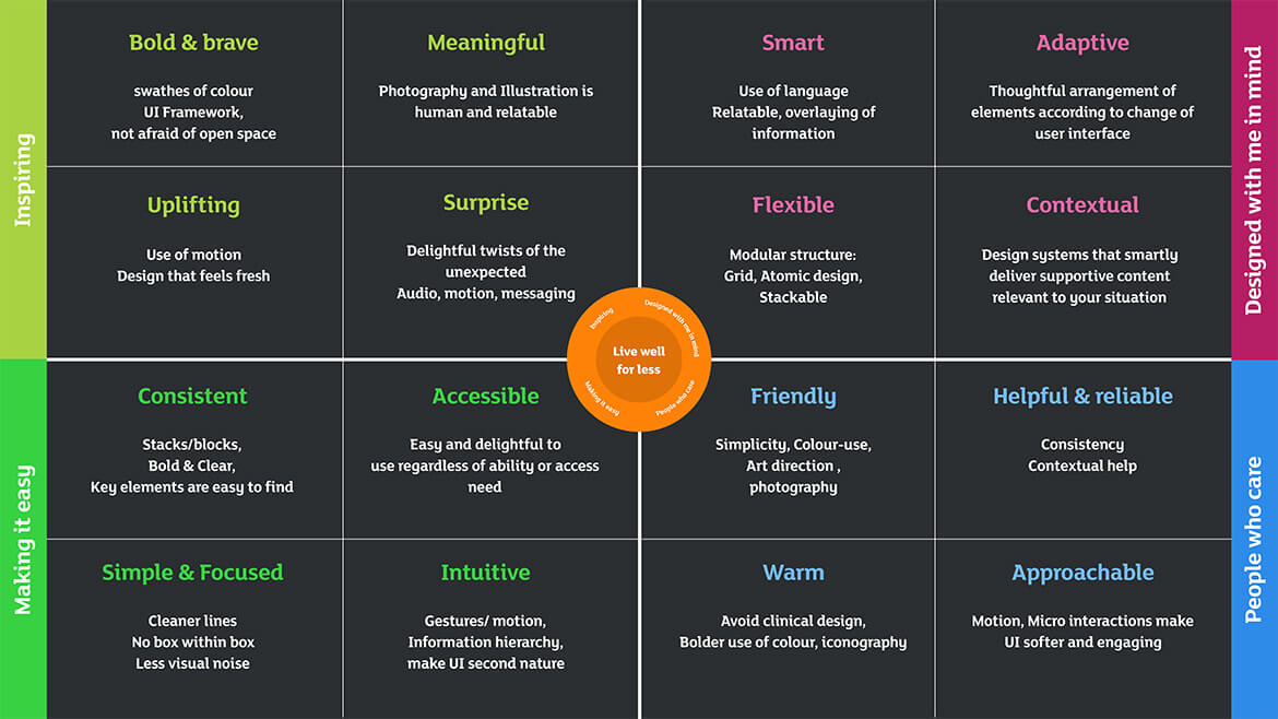
The Sainsbury’s brand proposition of “Live well for less” and the four subcategories needed to be simplified into pragmatic qualities that could be applied by visual and experience designers. We wanted a set of clear principles that we could measure our ambitions against.
A distinctive collection of values was established, specifically for visual design and experience design so that the entire team was working towards the same goal, always with Sainsbury’s commitment at the heart of our work.
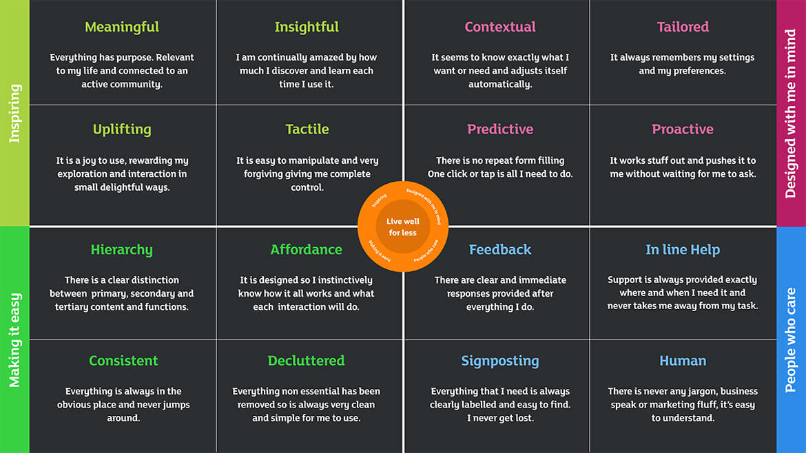
Art direction
Art direction manifesto
As we evolve the way we design for the digital age, we want to keep the idea of Live Well for Less right at the heart of everything we do. So how do we translate this idea into a design framework? Live Well for Less is about enjoying the little pleasures in life. It’s about caring for the tiny details of everyday life that go unnoticed to everyone else, but never to you. Our job as designers is to observe and help. It’s to inspire and surprise. Our job is to notice those little moments and make them a little bit more special. A little bit better.
A little bit easier. Every single day.
As designers, our job is never done, it’s constantly changing, adapting, and evolving. Just like the people we’re designing for.
Everything we do must be beautiful. Everything we make must feel just right.
Our job is to make The Beautiful Everyday.
Design principles in practise
Our design principles provided a sounding board for the art direction. Decisions made during the visual design process would constantly be measured against these criteria, including the mood boards below*.
Friendly & Warm
Simple & Intuitive
Flexible & Personal
Inspiring & Bold
Looks Good & Works Great
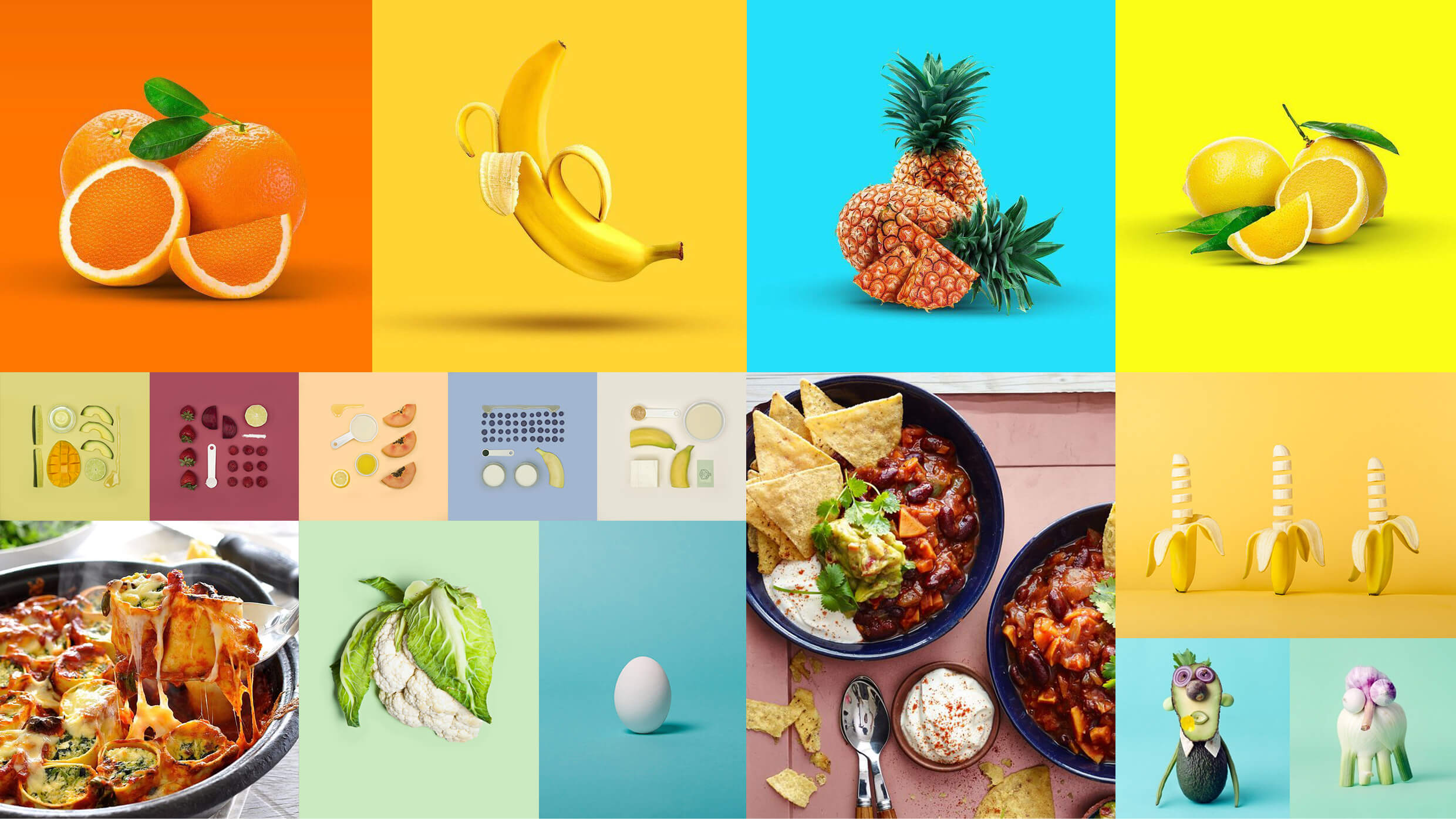
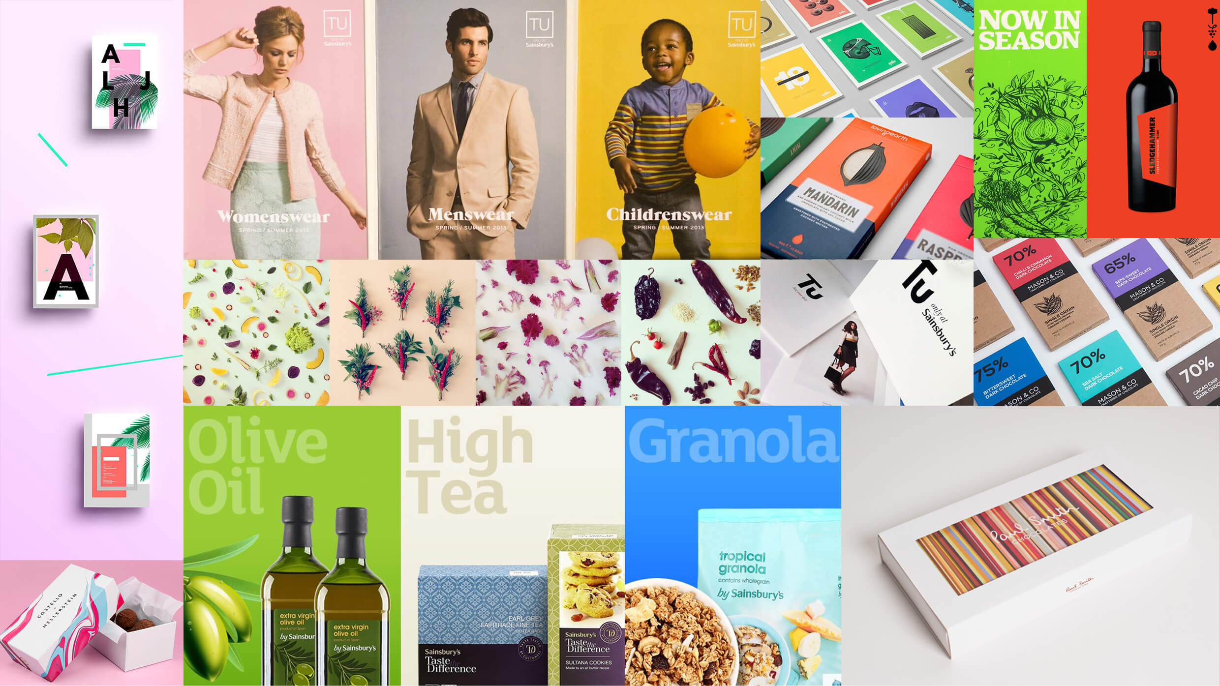
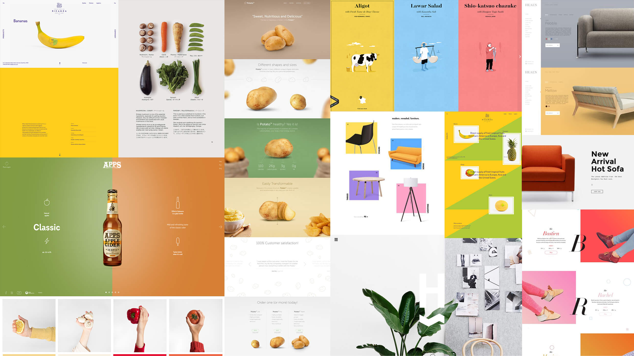
*Art direction moodboards. Copyright lies with original creators.
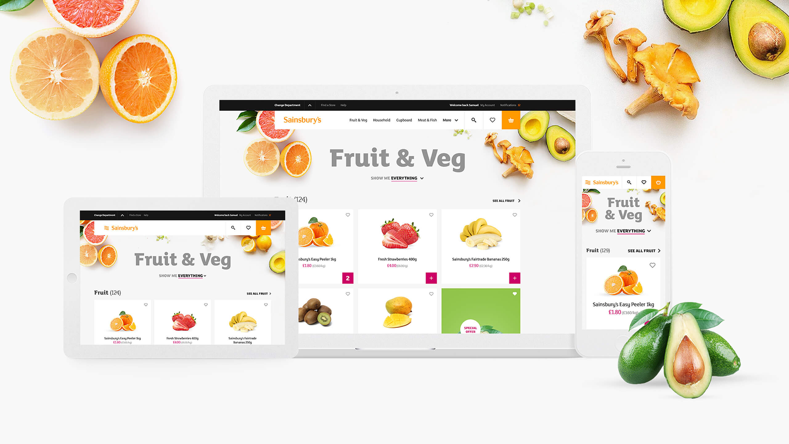
Look and feel
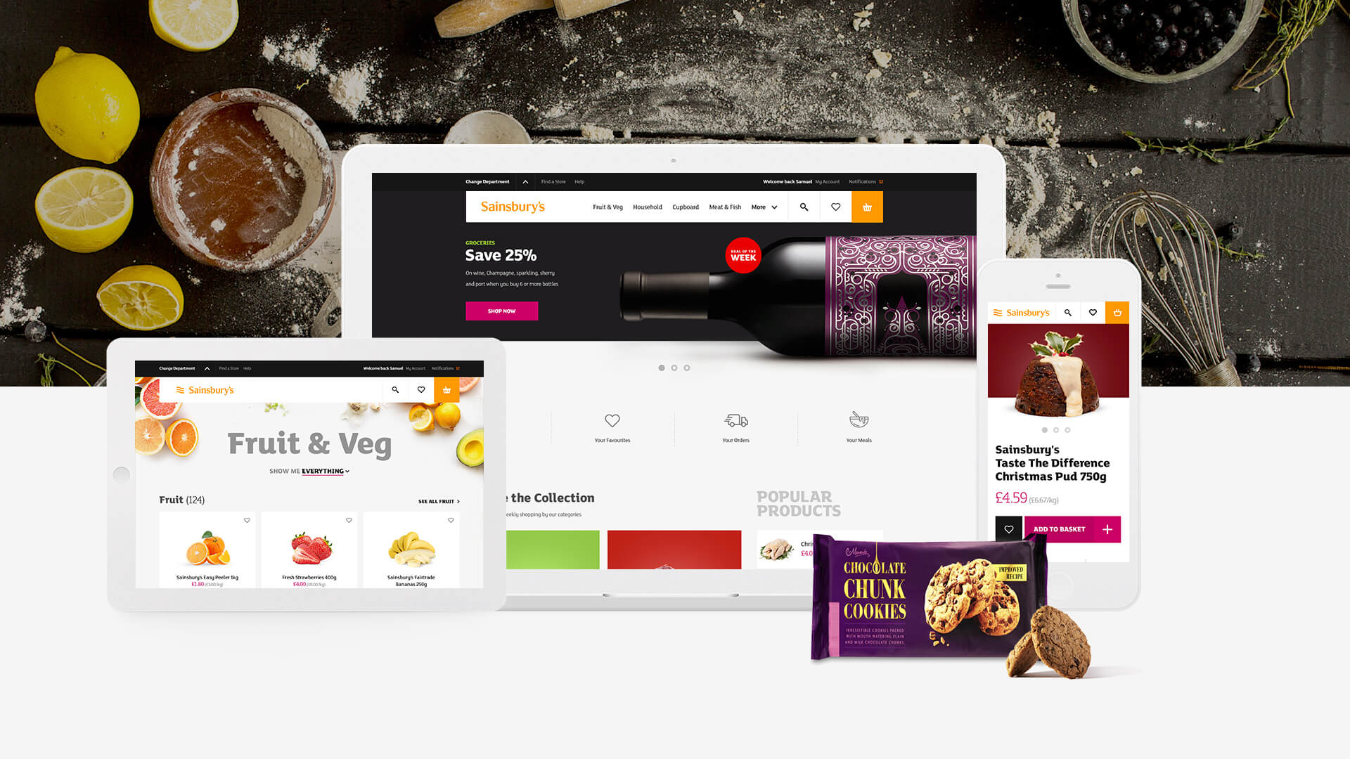
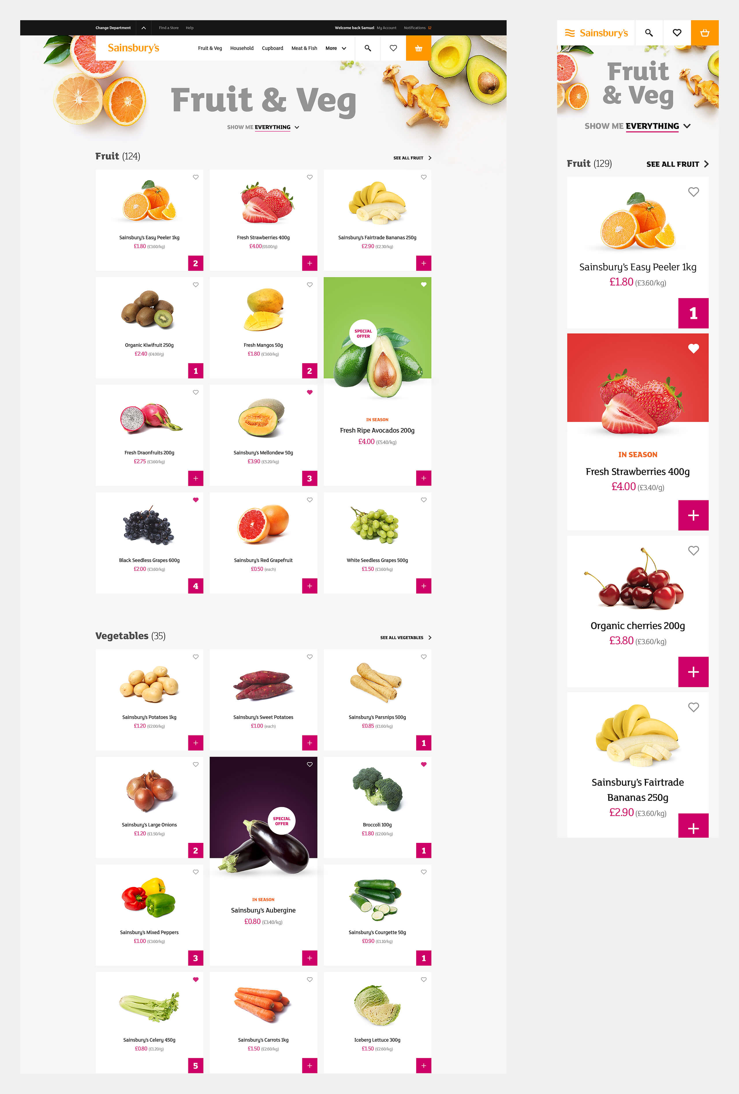
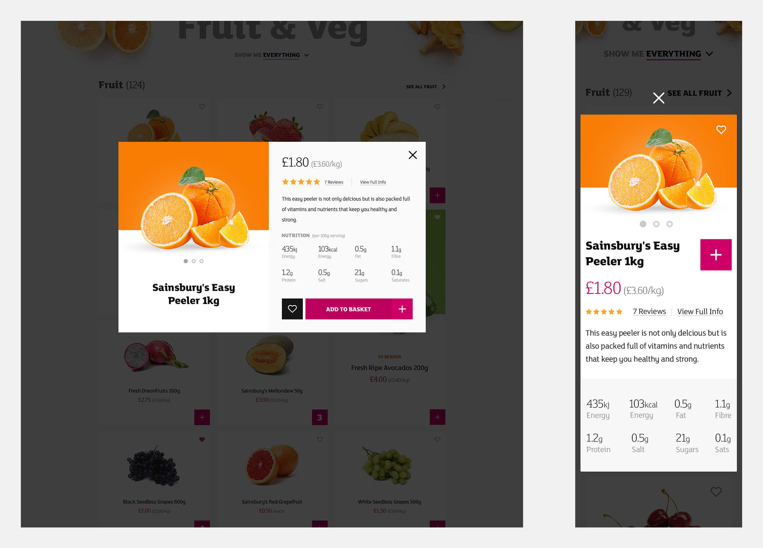
Our goal was to create a unifying visual language across all digital touchpoints that would reflect Sainsbury’s brand values. Based on the Art direction and Design principles we endeavoured to create a visual language that could not only be distinctive to Sainsbury’s but flexible to products and brands in their own right.
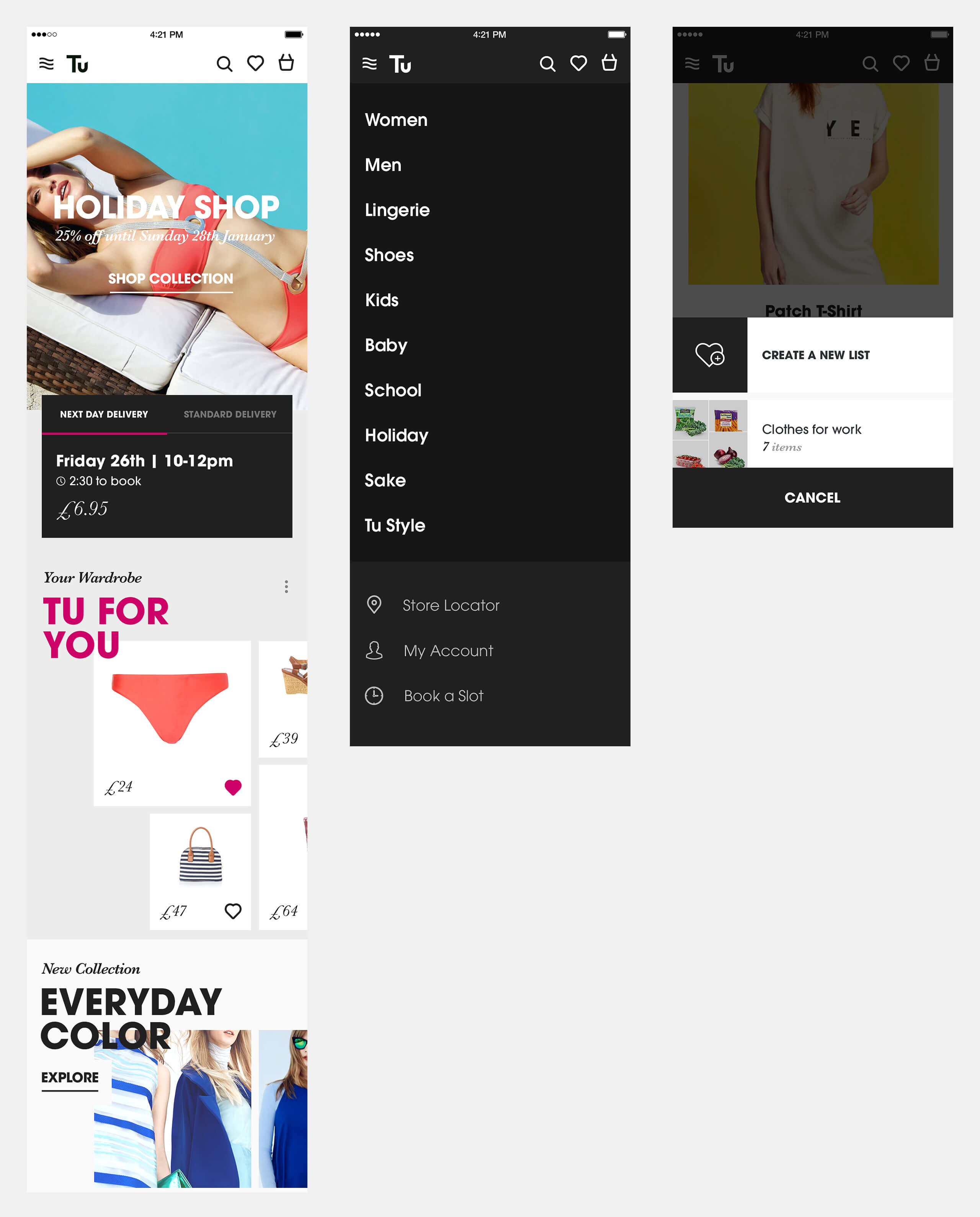
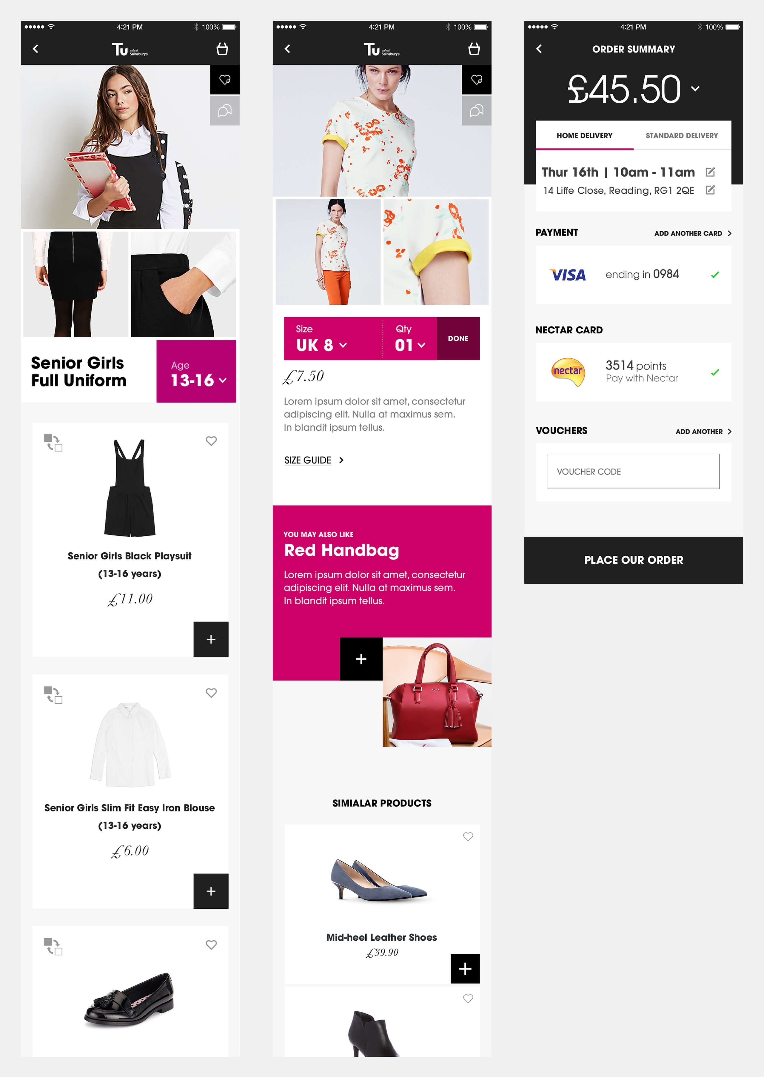
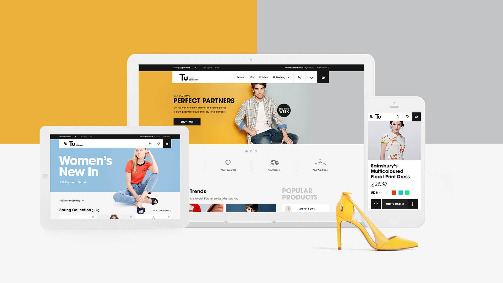
We brought this to life for two categories and their ecosystems - Sainsbury’s grocery products and TU clothing products.
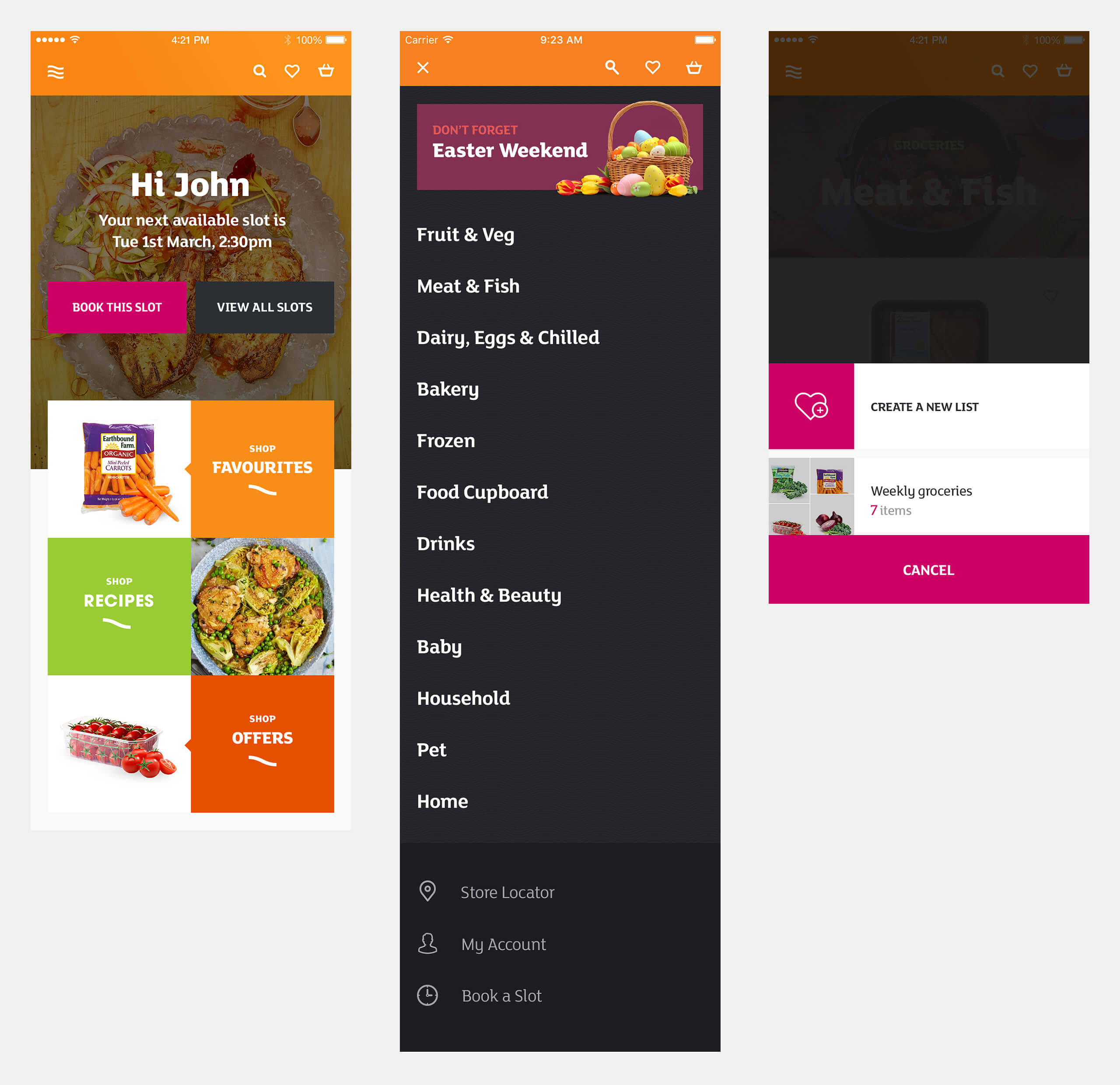
Sainsbury's groceries - home page

Sainsbury's groceries - product listing
Sainsbury's groceries - product quick-view
Sainsbury's groceries - product detail
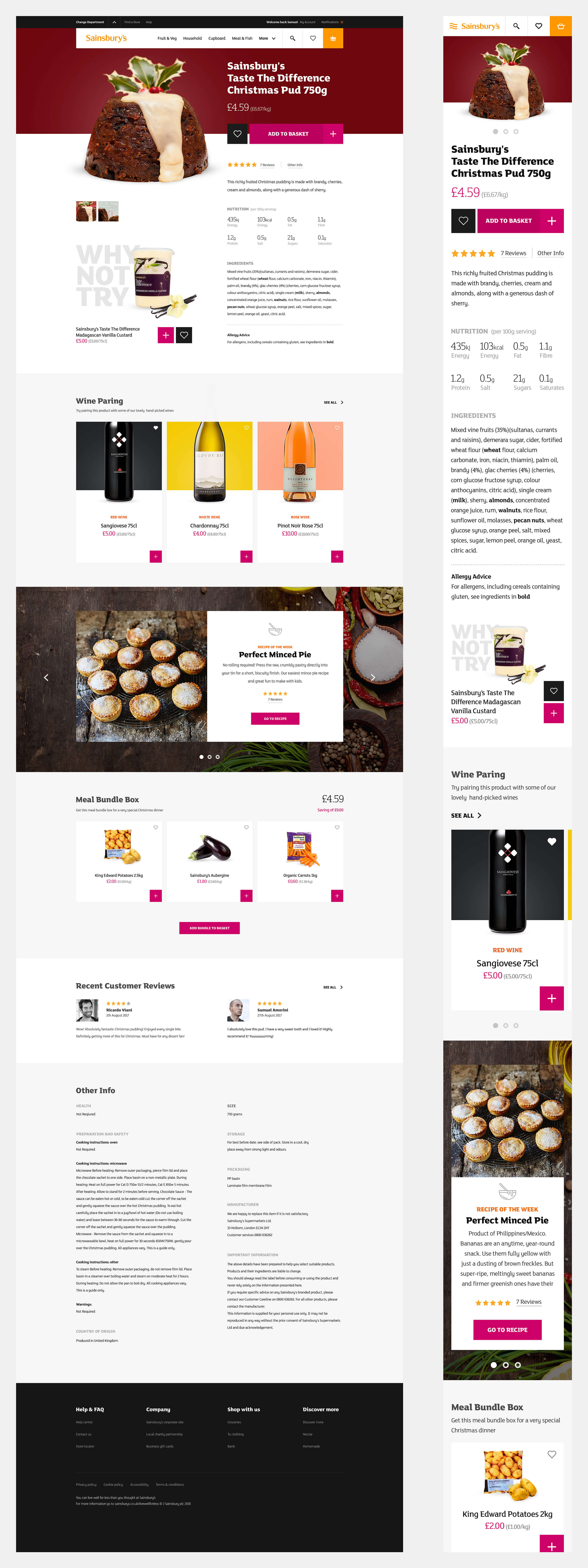
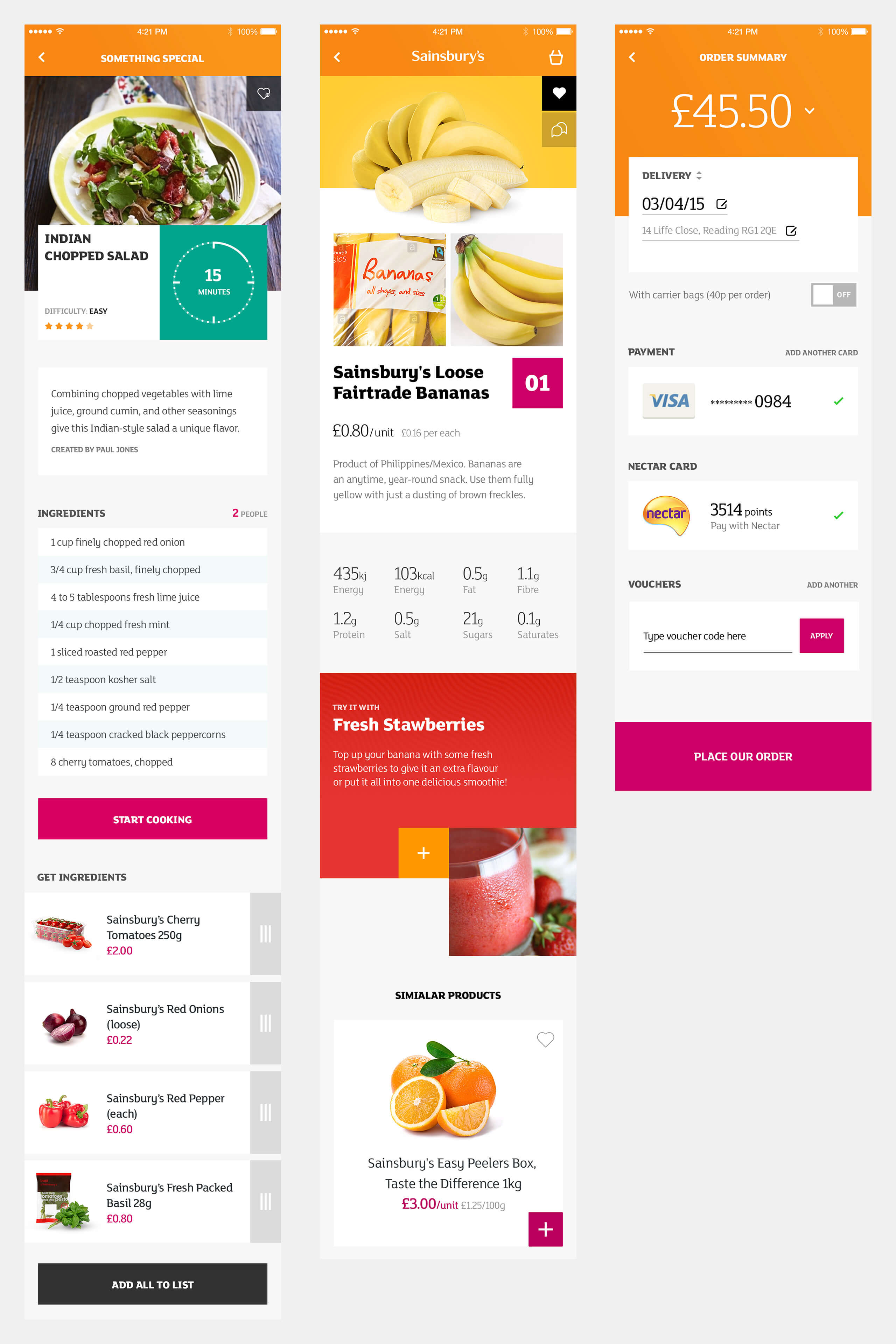
Sainsbury's groceries - Recipes

Sainsbury's groceries - Mobile app

Tu clothing - home page

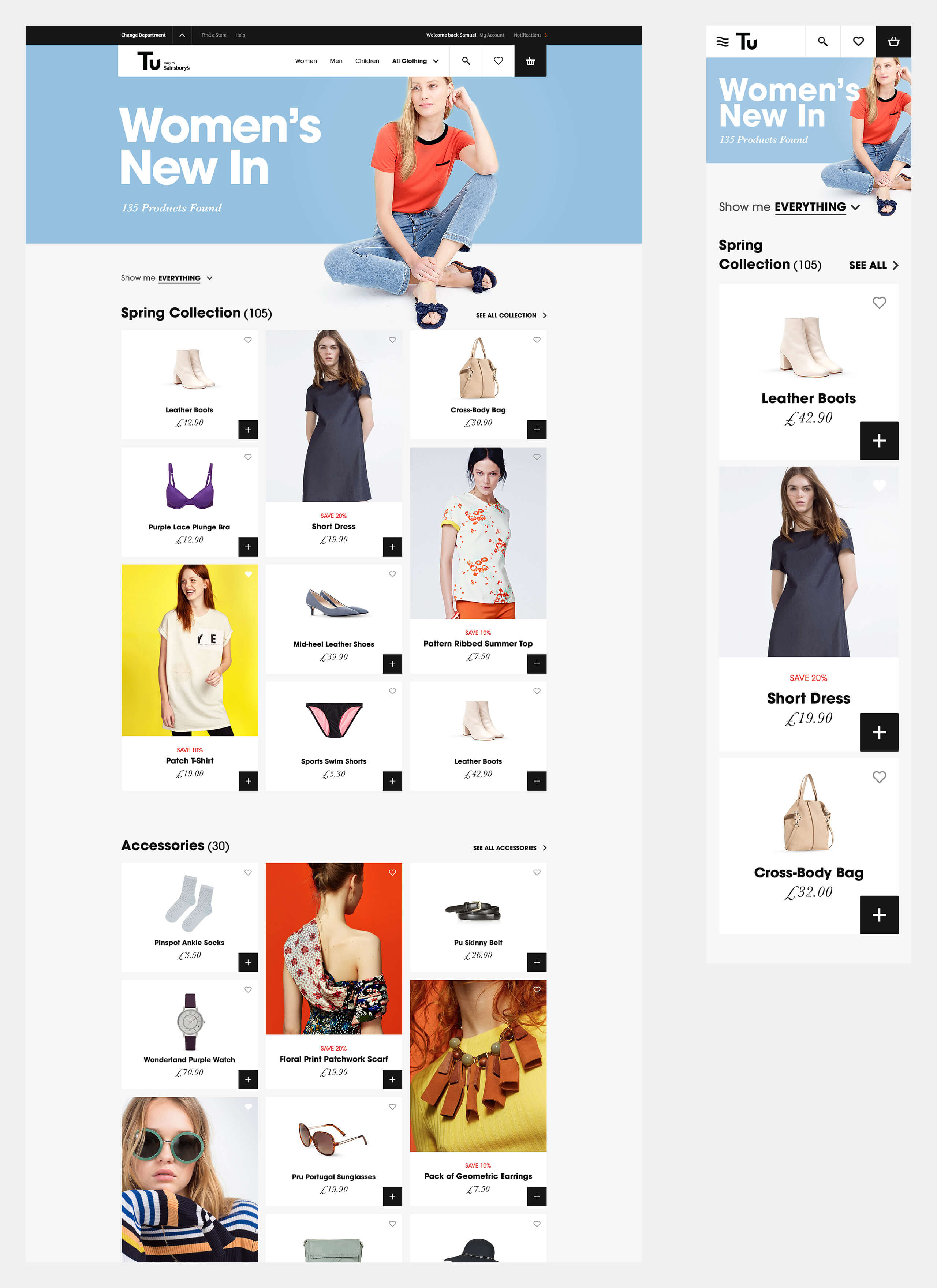
Tu clothing - product listing
Tu clothing - product detail
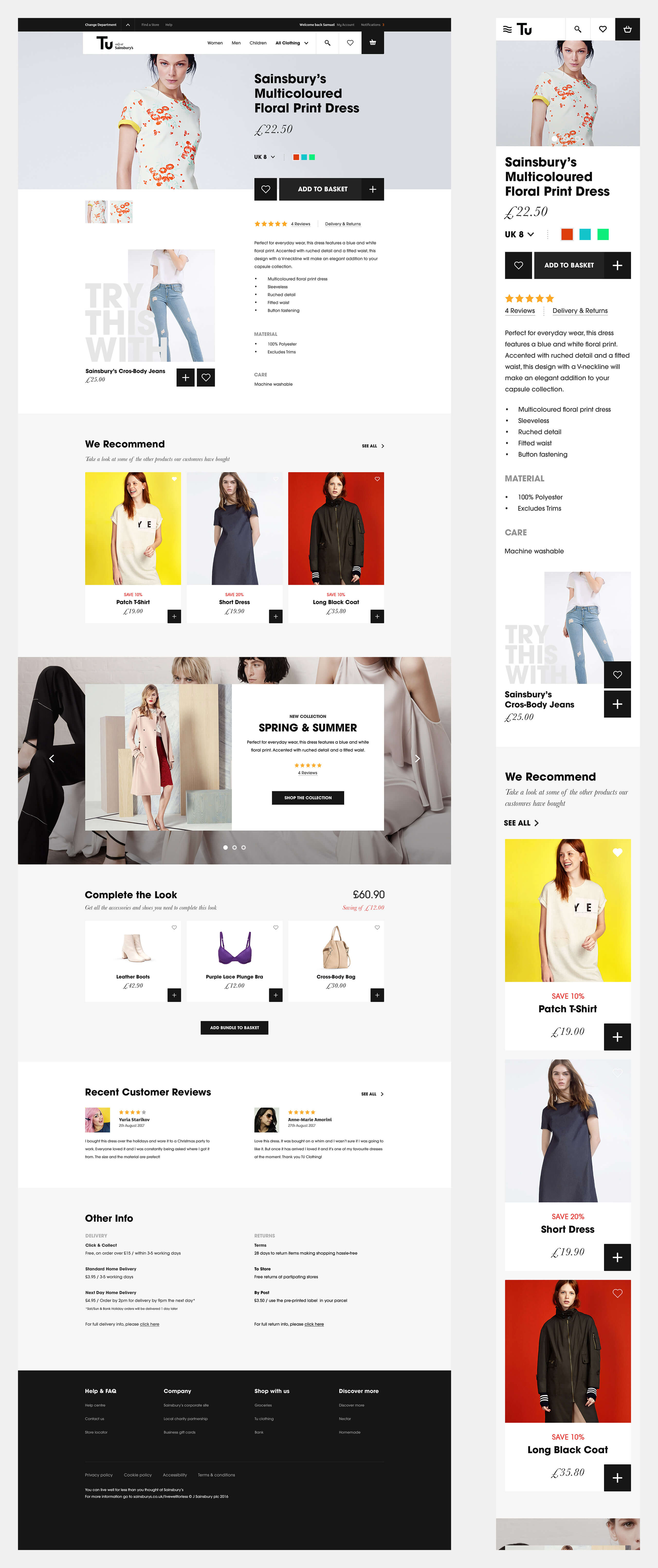
Tu clothing - Mobile app
