CLIENT
TikTok
TikTok for Business
Don’t make ads. Make TikToks.
TikTok wanted to make it easier for businesses, big and small, to advertise with them. TikTok for Business is a platform that serves all its current and future marketing solutions for brands. The unique and exceptional level of user engagement provides brands with the opportunity to create content that becomes part of the TikTok community and not separate from it like ads on other social platforms.
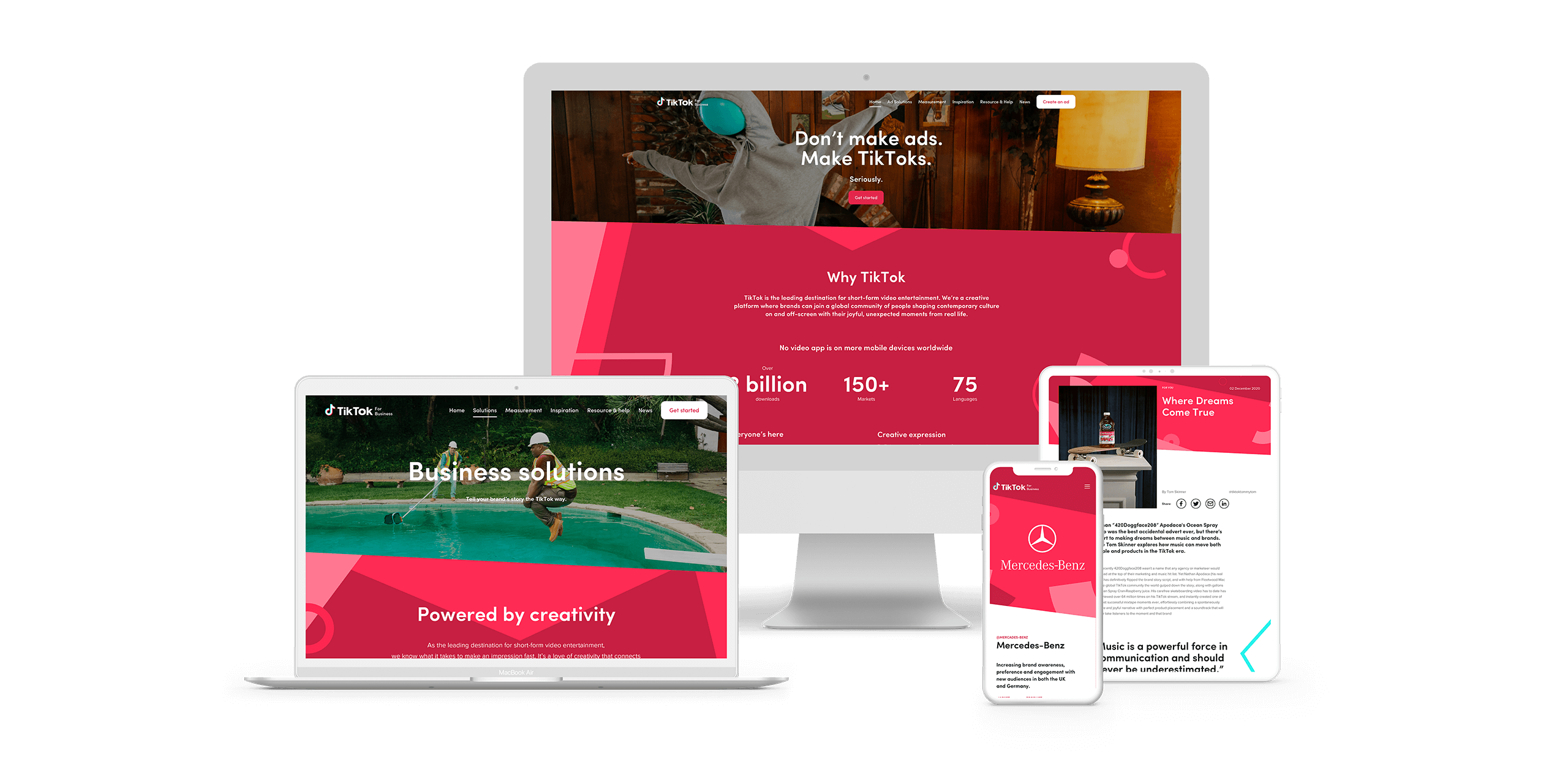
The timeline on this project was incredibly tight and included navigating a re-brief. The design phase of the project was managed entirely remotely, beginning shortly after COVID-19 lockdown.
As Design Director I was responsible for the creative and visual direction, overseeing the designer but getting hands-on where necessary. Alongside the Senior producer and Account director, I was involved directly with the senior client stakeholders.
TikTok for Business was delivered on time to a very happy client.
ROLE
Design Director
AGENCY
AnalogFolk
YEAR
2020

Challenges
As a mobile app-based platform that grew so quickly and virally, it is no surprise that the TikTok brand guidelines and assets we had to work with were extremely light (read: barren).
TikTok for Business branding was in the process of being commissioned but the ad platform was a priority and we had to create with what was available, within an extremely tight timeline. We had a logo, extremely limited colour palette*, typeface, and some decent photography (that’s something, right?).
*The brand colours were inaccessible in many scenarios so we had to find ways of using them smartly to pass WCAG 2.0 level AA compliance.
Almost all case-study assets only existed as TikTok videos which are mobile handset vertical 16:9. The aspect ratio is tricky to work with in a desktop/landscape environment. Any static imagery was limited to screen grabs of the highly compressed content which is hard to showcase with any quality.
Somehow, we had to rise above these limitations and create something that worked for the client brief.
Art direction
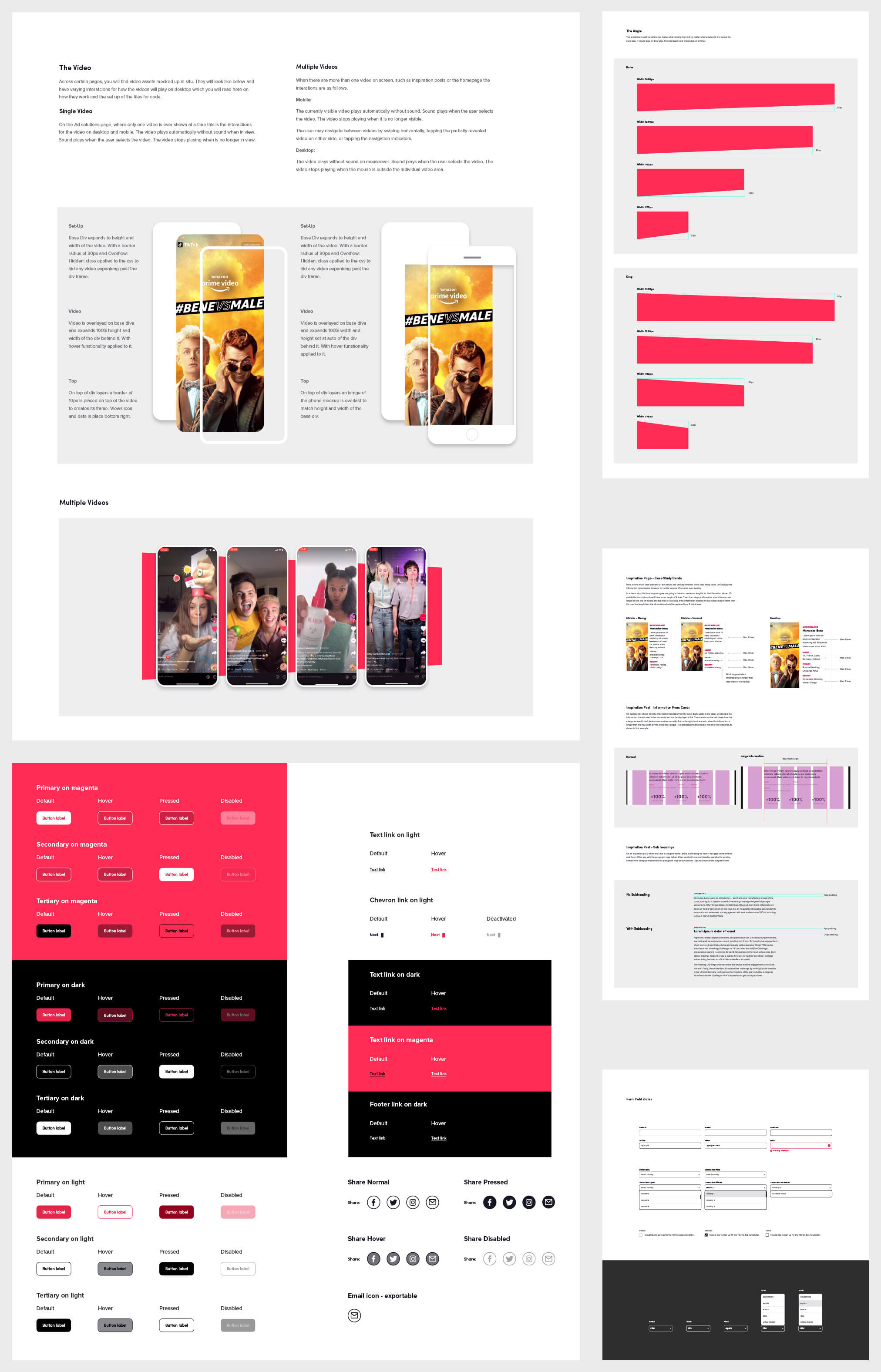
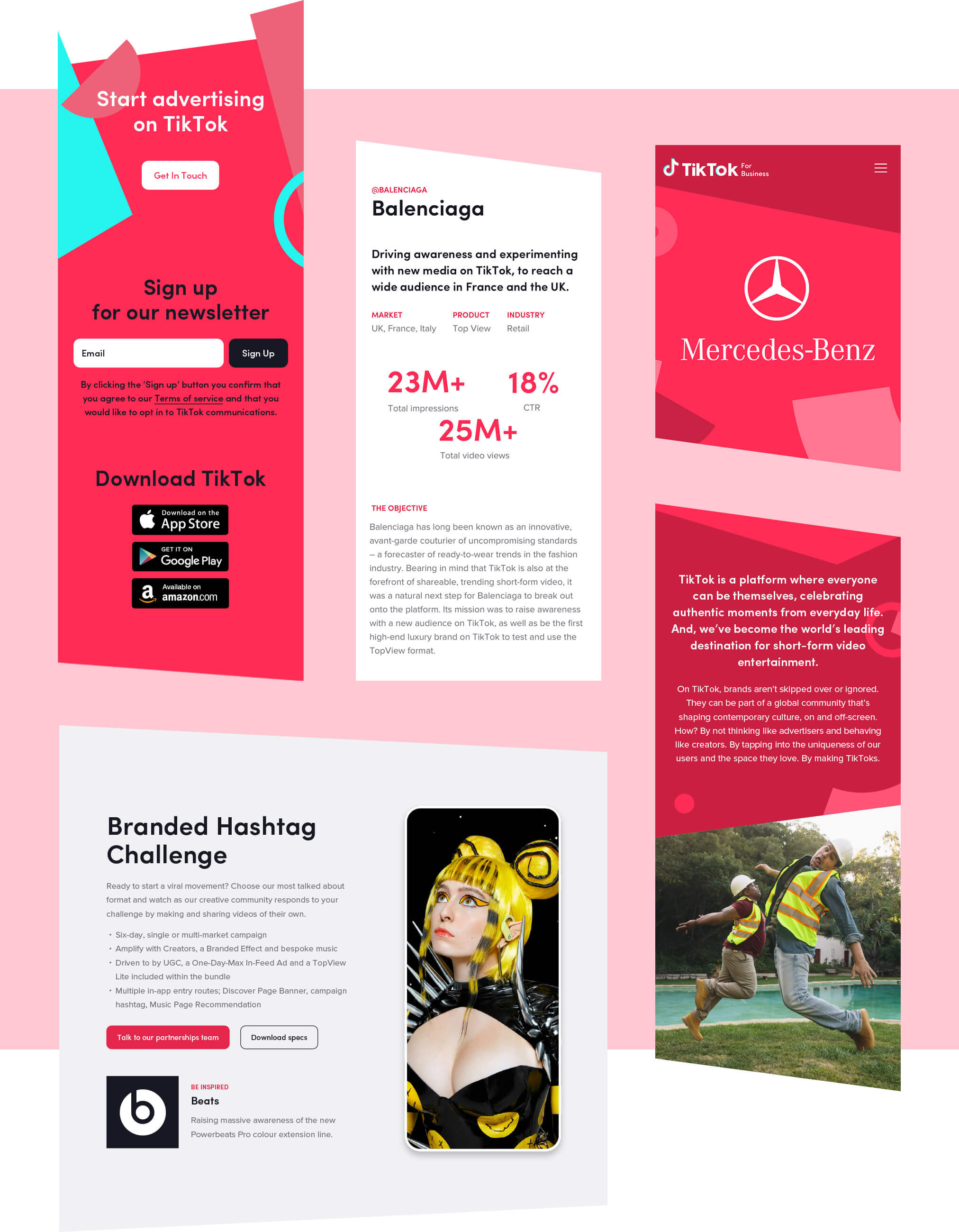
With a lack of brand elements available we needed to create our own. Referencing the musical note logo mark, an illustrative graphic language took shape that could be applied across the site. The colour offset of the same mark and the “O” from the logotype led to the angular bands that separate content and influenced the arrangement of shapes.
The brand's offbeat photography library formed a fantastic compliment to the bold graphics. Where there was a lack of high-quality imagery (like in case studies) the illustrations could be used as backdrops for advertisers’ logos.
To balance the bold imagery, the majority of content is on white/light background supported by sober typography with some emphasis in certain circumstances: Tiktok’s community engagement provided staggering statistics so we highlighted the numbers where suitable.

Site content
The obvious aim was to entice potential customers to advertise on their platform. To achieve this the audience needed to understand TikTok's products, benefits, and how they could be suitable for their brands.
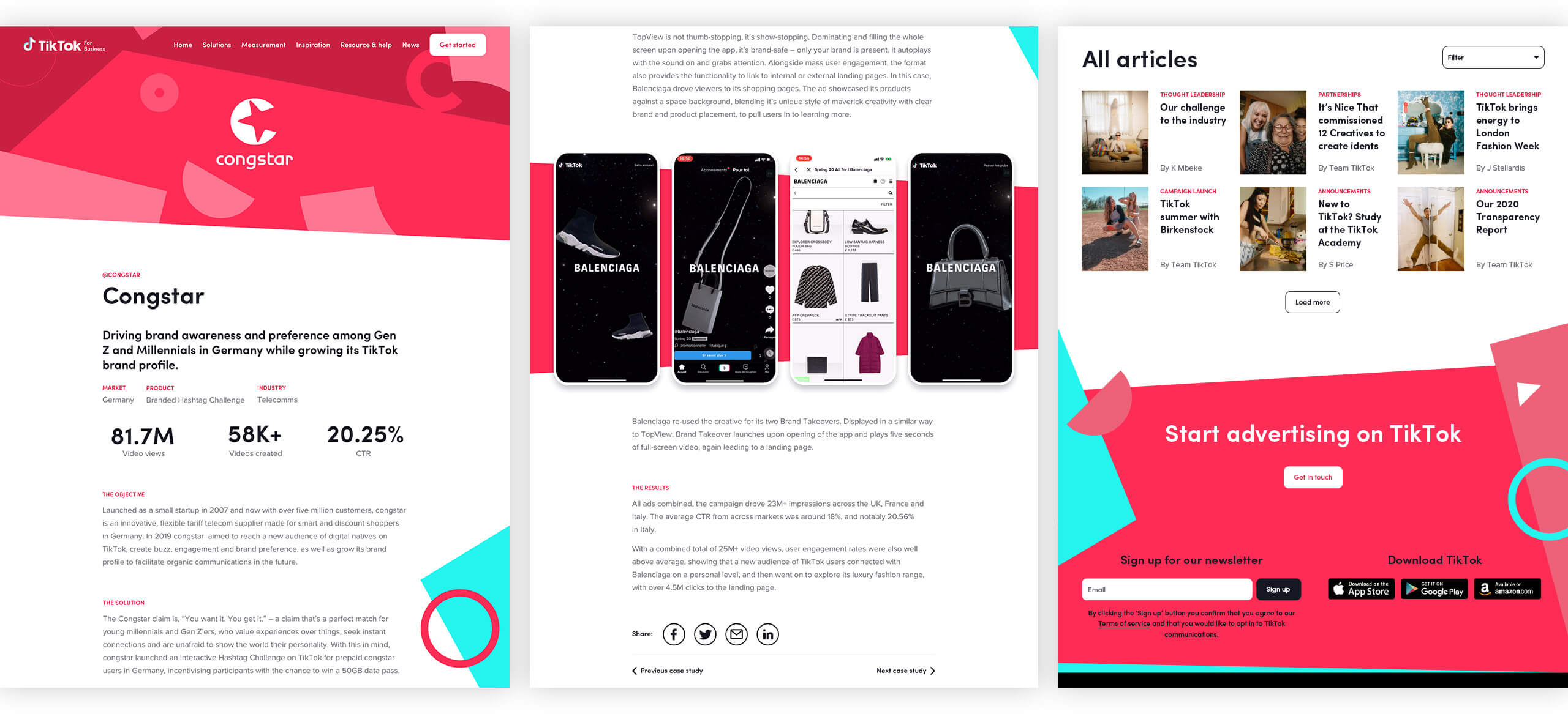
TikTok for Business showcases its unique ad formats like its flagship, TopView, which is the first video that appears when opening the app. Other formats include Brand Takeovers, In-Feed Videos, Hashtag Challenges, and Branded Effects.
Inspirational examples from a variety of brands are showcased to demonstrate that TikTok can work for small brands just as well as global brands. Resources are provided to help customers create their ads and of course, there are measurement tools to monitor the results.
The news section highlights the background to success stories and insights into TikTok’s phenomenal growth.


Design language & Sketch library
The site was designed in Sketch and a basic visual language and design system were established. Not only did this provide the client with a better understanding of the design but also made development and future updates more efficient.
